For the last two decades, the solution to every digital problem in higher education seemed to be “more.”
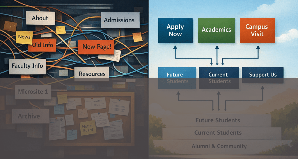
More pages to satisfy a department chair, more navigation items to ensure everyone feels included, more microsites for every new initiative, and more “just in case” content, archived deep within the subdirectories of a Content Management System (CMS), waiting for a visitor who never arrives.
We have spent years trying to solve complexity with addition, often at the expense of clarity.
We often talk about the future of higher ed websites in terms of technology. We discuss the next redesign or the latest design trend sweeping through the corporate world. But there’s reason to believe that the future won’t be shaped by new templates alone.
The future of higher ed websites will be shaped by harder decisions.
The next generation of university websites will look different not because they do more, but because institutions will finally become deliberate about what they don’t do.
The era of “add a page” is over
Every web professional in higher education has lived through the same cycle. A stakeholder asks for a page. To keep the peace, the page gets added. No one is assigned to own it long-term. It goes out of date, drifting into digital obsolescence. Five years later, it still lives in the navigation, confusing users and cluttering search results.
Multiply that single interaction by hundreds of requests across dozens of departments, and you get the modern higher ed website: a sprawling, unmanageable archive of institutional history rather than a functional tool for prospective students, donors, current students, and parents.
The future requires a fundamental mindset shift. We must accept that not every request deserves a page.
Future-ready institutions are moving away from being digital storage units. instead, they are learning to:
- Ruthlessly prioritize top tasks. If a user cannot apply, donate, or find a program within seconds, the site is failing, no matter how much news coverage is archived.
- Design around decisions, not departments. Users don’t care about your org chart. They care about their goals.
- Treat deletion as maturity. Removing outdated content is an act of stewardship.
“One website for everyone” is a convenient, but costly myth
For too long, university websites have operated under the pretense that all audiences are interchangeable. We build “The Homepage” as if a panicked parent concerning tuition, a seventeen-year-old prospective student, a tenured faculty candidate, and a local community member are all looking for the same thing.
The truth is that they are not. They are not asking the same questions, and they certainly do not operate with the same level of confidence or context.
A first-generation student might need definitions for terms like “matriculation” or “bursar.” A faculty member just wants the link to the portal. When we try to speak to them all at once, we end up speaking to no one.
The future of higher ed websites acknowledges this reality. This doesn’t mean we need to employ creepy tracking pixels or over-engineered personalization engines that try to guess a user’s intent. It simply means creating intentional pathways.
Future-facing sites will:
- Stop forcing visitors to translate institutional language. We must meet users where they are, using their vocabulary, not ours.
- Let people self-identify. Clear gateways (e.g., “I am a…”) allow users to filter out the noise immediately.
- Reduce friction instead of celebrating comprehensiveness. Clarity for a prospective student might mean hiding administrative content that is irrelevant to them.
Content will be designed for change (not perfection)
One of the quietest failures in our industry is the fragility of our websites. We build them as if they are statues, permanent monuments to be unveiled at launch.
But in reality, a single update often requires multiple editors, manual page-by-page changes, and a lingering fear of breaking layouts. If changing a tuition rate requires a developer or a week of review, the system is broken.
That level of manual labor is not sustainable. The future belongs to institutions that invest in structured content.
This means moving away from big “blobs” of text on a page and moving toward data-driven content models. It means using reusable components where a change in one place propagates everywhere. It requires a clear separation between content (what we say) and presentation (how it looks).
This is about acknowledging that change is the only constant in higher education. Tuition changes. Programs change. Deadlines change. Websites that cannot adapt to these changes instantly become liabilities, no matter how beautiful they looked on launch day.
AI will expose weak content strategy (not fix it)
There is a pervasive hope that Artificial Intelligence is coming to save messy websites. There is a belief that we can simply point an AI at our thousands of unstructured pages and it will magically answer user questions.
AI is not coming to save messy websites. In fact, it will make your problems more visible than ever before.
Large Language Models (LLMs) and AI search tools rely on clear, authoritative source material. Institutions with duplicated content, unclear ownership, inconsistent tone, and bloated page structures will struggle the most. If your site has three different pages listing three different application deadlines, AI will confidently serve the wrong answer to your prospective students.
Used well, AI will be a powerful tool to:
- Highlight what is outdated
- Discover gaps and redundancies
- Suggest clearer, plainer language
- Reduce manual governance work
However, AI only works when the underlying content strategy is sound. The future belongs to teams who see AI as leverage to enforce quality, not a shortcut to bypass strategy.
Accessibility will stop being treated as a separate track
For years, web accessibility has been treated as a compliance checklist, something included in a project plan to avoid a lawsuit.
We are learning that the most accessible websites are almost always the clearest, the simplest, and the most intentional. When institutions design for cognitive load, they help users with learning disabilities and users who are stressed and rushing. When they design for mobile-first usage, they help users with motor impairments and users on slow connections.
When we prioritize plain language, everyone wins.
The future of accessibility isn’t just about technical compliance or ARIA labels. It is empathy operationalized. It is the recognition that our systems can induce stress or alleviate it, and we have a choice in which path we take.
Web teams will be forced to lead
Many higher ed websites struggle because decision-making is too diffuse, not because of a lack of tools, budgets, or talent.
Universities are often consensus-driven environments. But when everyone has a veto, nothing bold gets done.
The web team has traditionally functioned as a service bureau, taking tickets and fulfilling orders. The future demands that web teams function as strategic leaders.
This requires:
- Clear governance: Who gets to say no?
- Empowered web leadership: The ability to reject content that doesn’t meet strategic goals.
- Fewer veto points: Streamlined approval processes.
- Alignment around outcomes: Measuring success by enrollment and engagement, not by internal politics.
Websites are mission-critical business systems, not just digital brochures. And mission-critical systems require ownership. Institutions that do not address this governance gap will keep redesigning the same problems every five years.
The real future
The future of higher ed websites is not flashy, and it isn’t about the metaverse or VR campus tours.
Instead, it is about fewer pages with clearer purpose and content designed to change and about technology used with restraint. It is also about accessibility baked into every decision. And most importantly, it is about leadership willing to make the hard choice to say “no” to the good ideas so they can say “yes” to the great ones.
The institutions that get this right will have websites that actually work for the people they are meant to serve, and for the teams tasked with maintaining them.
What about you? What do you foresee for higher ed websites?

Leave a comment